Sonoco | Origen
Sonoco is a leading global supplier of packaging solutions who tasked our agency with the naming, design, and building of an account-based marketing plan for the launch of their new product.
Client: Sonoco
Year: 2020
Role: Designer
Capabilities:
Brand Strategy | Naming Convention | Language Identity | Visual Identity | Marketing Strategy | UX | UI | Web Design
Year: 2020
Role: Designer
Capabilities:
Brand Strategy | Naming Convention | Language Identity | Visual Identity | Marketing Strategy | UX | UI | Web Design
Scope
Create a robust, flexible identity for Sonoco’s new product that is extensible across organic, greenfield and acquisition driven growth.
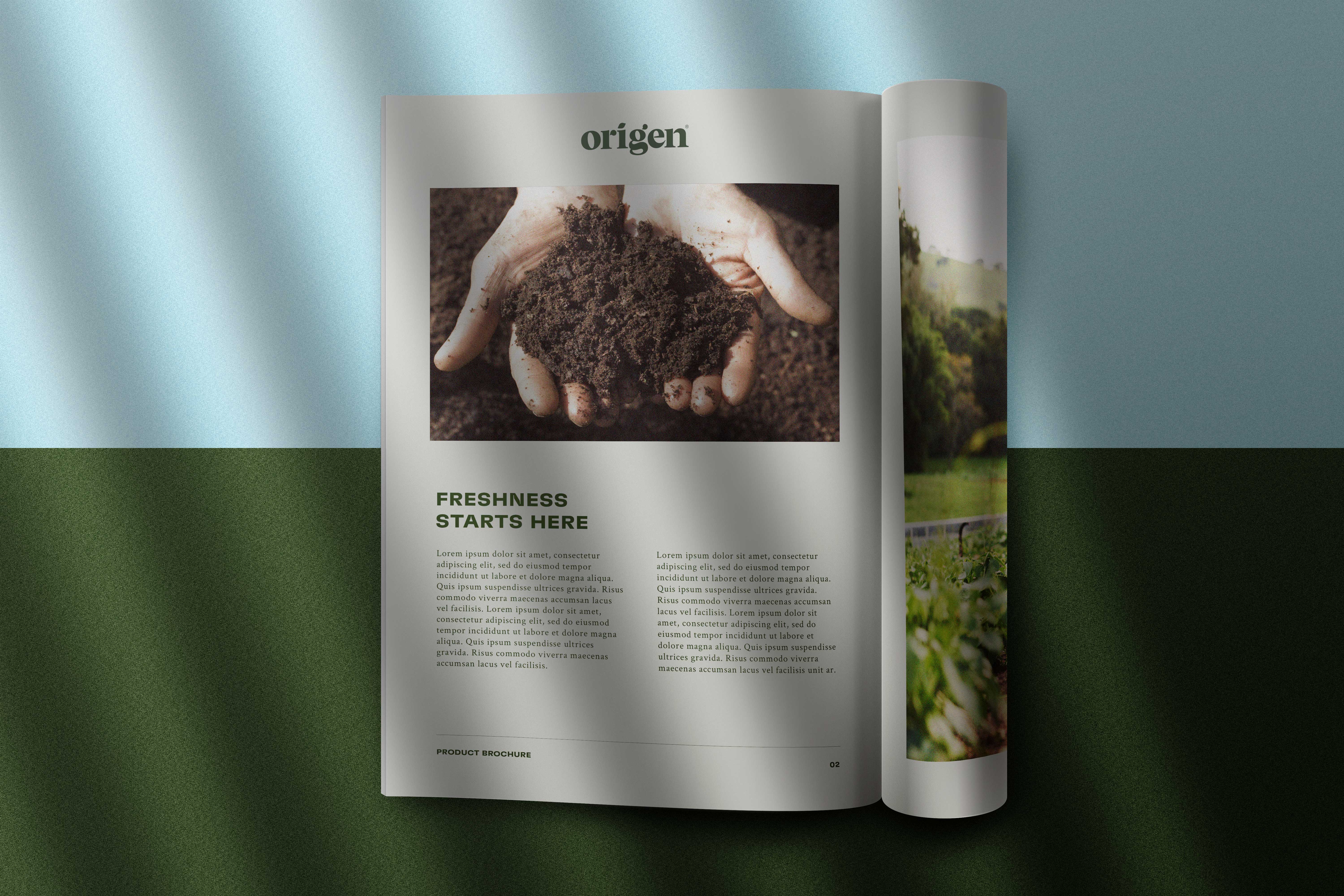
Develop a direct mailer campaign to influence grower perception and support to achieve the the client’s vision.
Problem
The launch of Sonoco’s latest packaging solution fast approaching. With audience research and messaging strategy in place, all that was missing was a name and design system. This void was also preventing the company from moving forward with much-needed marketing materials for an awareness campaign targeting produce growers.
Outcome
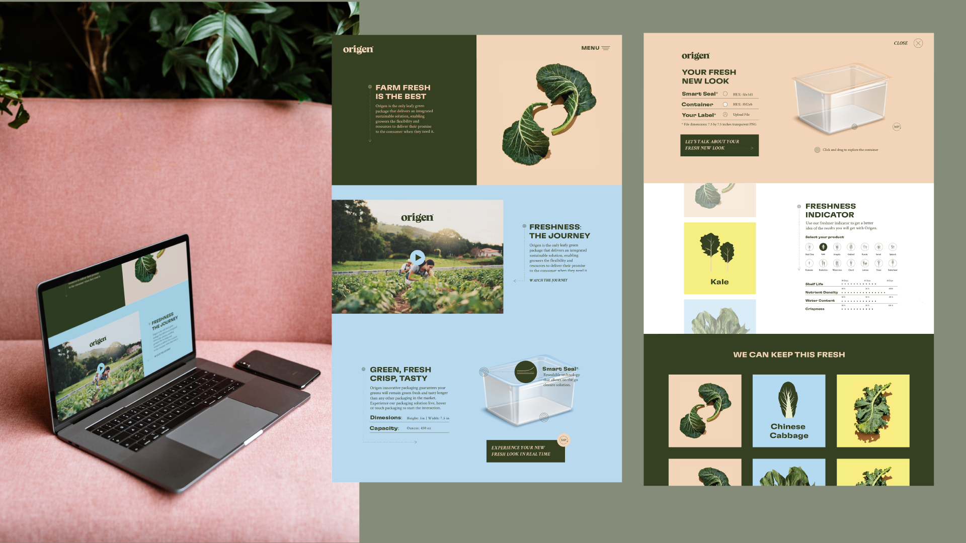
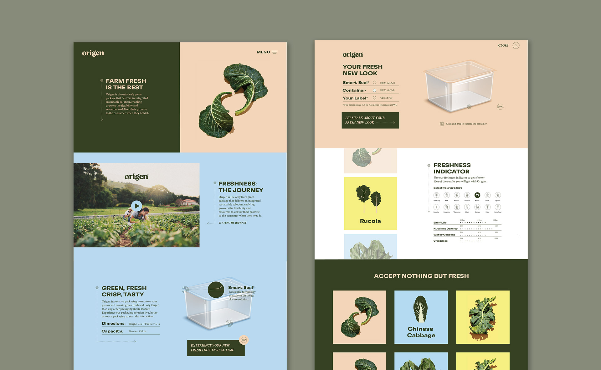
Adoption of our team’s proposed naming schematic and visual identity for Sonoco’s new product.
Delivery of brand guidelines, creative assets, and final designs for the production of B2B marketing touchpoints.
Understanding
Because each packaging unit exhanges many hands during its lifecycle – from harvesters at commercial farms to grocers, all the way to the average retail consumer – its identity had to be appropriate for all types of users at any given stage.

Through client interviews and competitve research, our team distilled key naming criteria to inform ideation.

Process
Equipped with a better understanding of the product and defined criteria, we started our ideation process with word association exercises and were able to generate lists of hundreds of ideas for names. We presented the top two concepts to the client with accompanying moodboards.


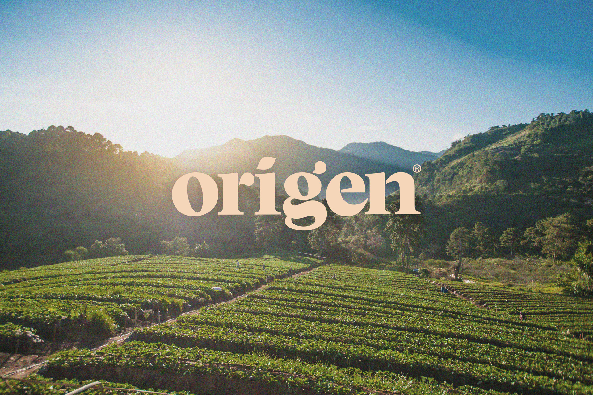
“Origen” ended up being the winning concept, so we immediately set to work defining the visual foundations of the product’s emerging identity.
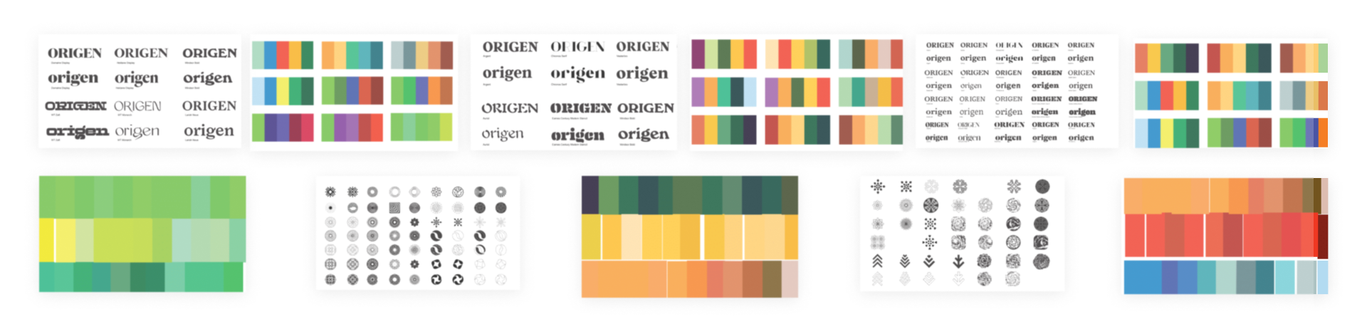
Solution